by Bill Cunningham
Ted invited me to expand on a comment I made here on how the case can be made for rethinking the design standard for movie poster artwork in order to maximize the visual value to today’s audience, considering a film will likely be discovered online. What I’m proposing is taking the movie poster and turning it on its side, filling our view on the screen and our heads with storytelling potential. Not so much a radical rethink of key art design, but the next step in what has been an evolutionary process tied to distribution. People do judge a movie by its poster, and if independent filmmakers and distributors are to maximize their resources without maximizing costs, then the role and design of key art is definitely in order.
THE ROLE OF THE MOVIE POSTER
A picture is worth a thousand words, but a (good) movie poster ignites a thousand ideas – an expression of both art and commercial intent, selling the movie to the audience. It does this through craft, style, technique and marketing – ballyhoo made manifest. This is why key art is important, especially to the indie, because if it makes a positive impression, it means the potential for financial as well as artistic success. The better your key art, the lower the sales resistance.
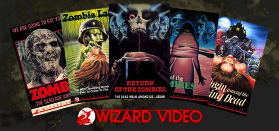
THE TRADITIONAL MOVIE POSTER / KEY ART
 It’s important that we understand the basics of what we call the movie poster. The standard movie poster has become a vertical 27” x 40” design originally made to fit inside a theater’s display. [This ignores lobby cards, window cards, the insert, the half-sheet, and the 3 and 6-sheets as well as the European and Asian anomalies. For argument’s sake we are going to go with this “standard”]. This 27×40 vertical image has become the basis for all of the ancillary marketing materials including, billboards, newspaper ads, bus stop and subway posters, web headers, web page sidebar images, publicity packages (usually sent via email), and of course, listing pages on websites such as Hulu, iTunes, Netflix and Amazon. Here is where we begin to run into some problems.
DISTRIBUTION CHANGES EVERYTHING
Back in the dark ages prior to VHS, the movie poster ruled all. Post-cassette, movie poster design changed to meet the demands of the new format and how it was distributed to the retailer and the audience. Certainly, the movie poster was there, but it suddenly wasn’t as “necessary” as “box art.” Suddenly, the poster was simplified because the presentation was smaller. That meant brighter colors, simpler design, and cleaner title treatments that could be read from ten feet away. For classic movies it meant that the poster was either redesigned or ignored entirely in favor of a brand new design that fit the needs of retailers. The actual movie poster design, generally seen only in the video stores, became an afterthought, and was often presented at a smaller size – more of a flyer than poster.
In 1997, DVD emerged and squared the VHS box art design. Designers were creating one piece of key art and redesigning it for VHS (on its way out) and DVD. All still based on the same vertical poster design.
Until the “widescreen television” arrived, widescreen was a visual anomaly to the viewing public. I can recall multiple times customers watched a widescreen VHS and sent a letter to us stating there was something “wrong” with their video. There were black bars at the top and bottom of their TV screen! They were so used to the 4:3 squarish aspect ratio of old school television they couldn’t fathom widescreen 16:9 aspect ratios on their TV.
We are in the beginnings of the digital (r)evolution in motion pictures and television, and widescreen has become the norm. More people are foregoing the cinema and attending their home theater that has the same quality picture, sound and none of the headaches. We sit at home and order up a movie on demand through a variety of platforms and services. According to the National Association of Theater Owners (NATO) in 2012, there were over 39,662 movie theater screens available to the viewing public across the United States. (source). However, when compared to the 58.31 million Ipads sold in 2012 (source), and adding in all of the other viewing and marketing opportunities (Kindles, Tablets, mobile phones, computer screens, and connectivity devices like Roku) then you can see that a dramatic change has occurred. Unfortunately, key art design has not kept pace with digital distribution, and is stuck in an analog design space – the equivalent of the 4:3 problem. It’s awkward, clumsy and a relic for a bygone age. You must scroll up and down to get the full impact of the poster echoing the “pan and scan.” Just as we have done with previous media formats, we must redesign key art for the predominant movie-watching and distribution method – the internet.
WIDESCREEN KEY ART – WHAT DOES IT GET YOU?
It seems almost too simple to make much difference, but to shift key art from the vertical to the horizontal opens up all sorts of visual and design possibilities to better communicate your movie’s story to its audience. If you’re not convinced, ask any cinematographer or director on the impact of shooting widescreen on their visual storytelling. Imagine watching videos on Youtube or at the theater in a vertical format, and you begin to see how a simple shift of perspective makes a huge difference in perception.
Given that our televisions, ipads, tablets and phones are all widescreen, and given that we are already designing for billboards, newspaper boxes, subways, and other horizontal marketing – it’s past due for horizontal thinking to fill that webspace with our widescreen image. But the question Hollywood asks is, “What does that really get us?”
Well –
- Widescreen design complements the webpage / billboard / Netflix page with an image that fills your view and visually communicates everything about your movie.
- Because it is complementary to the webpage, widescreen images are easier to share on a variety of devices and platforms.
- For physical objects such as posters and billboards, the impression you make on the audience is longer because the image takes longer to clear your view as you walk past. Walk past a poster on the wall and then walk past a landscape.
- Widescreen means “epic” to the viewer’s subconscious. People judge a movie by its visual impact. An epic widescreen poster = an epic film. Something with scope.
So let’s start designing for the iPad and the television and any other device that has a better chance of luring the audience to your brand of filmed entertainment. If your key art is awkward on the page it subliminally communicates that your film is awkward. Not a good start when you’re trying to get someone to “click and buy” your movie.
EXAMPLES
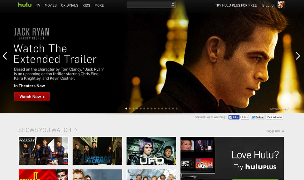
If you think this is radical or that “Hollywood” will never go for it, then understand that it’s already happening around you at this very moment. One of the best examples is Hulu. Below is a screenshot of the Hulu homepage. Note how the advertisement for the JACK RYAN: SHADOW RECRUIT movie trailer fills the page. The darkness at the left is perfect to add the text and link. It could easily be used for additional imagery, the billing block and so on.
But what is really telling is how the television series thumbnails below it are all composed in widescreen even though for some of these shows, their aspect ratios are 4:3 and not 16:9 .
The visual grammar is there, we just haven’t standardized it to movies (except in the case of billboards) If you take a look at the digital comics market, such as at Thrillbent you can see they have embraced the digital widescreen standard in their page designs, and have kept it simple for a better audience experience. The same standard applies to movies – we need to provide an easy audience experience.
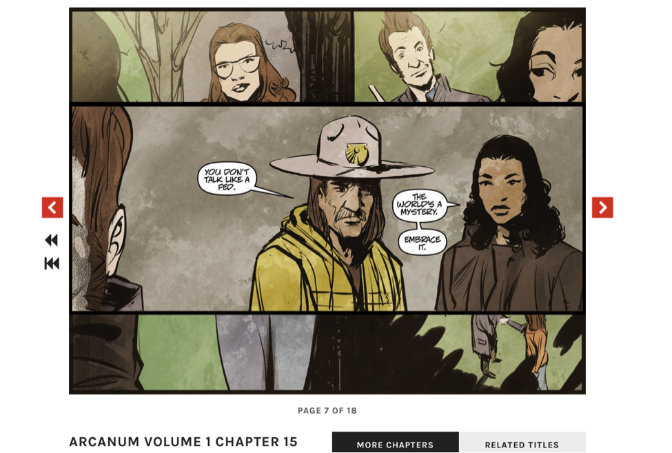
© 2014 by Thrillbent
IN CONCLUSION
We must push the limits of our key art design philosophy to keep pace with the technology if we are to lure eyes to our products, and be able to share them across the many digital platforms that make up our “multiplex theater chain.”
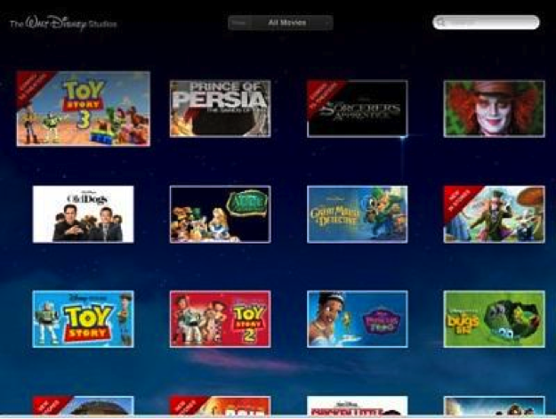
You see art like this to choose your movie…..
But you watch movies like this.
Doesn’t there seem to be a disconnect? Especially when more and more people are beginning to see movie platforms and apps that do this: